

You are using an out of date browser. It may not display this or other websites correctly.
You should upgrade or use an alternative browser.
You should upgrade or use an alternative browser.
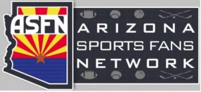
New ASFN logo.
- Thread starter Shaggy
- Start date

Brian
PANEM ET CIRCENSES
Not trying to be obstinate, I like the one on the left more.
BigRedRage
Reckless
the one on the right is cleaner, the left one could be cleaned up to appear more like the right one
mwanamatapa
Veteran
- Joined
- Aug 19, 2012
- Posts
- 227
- Reaction score
- 94
One on the left - it's less cluttered
kerouac9
Klowned by Keim
I'd rather stick with the old logo over either of these. If you forced me to choose one I'd choose the one on the right.
But both are pretty terrible.
But both are pretty terrible.
One on the left - it's less cluttered
What he said.
Not trying to be obstinate, I like the one on the left more.
That is the S.A.F.E. choice.

Like the stars in the one, but the clean blue field in the other.
Along the lines of what Mulli said; I prefer the logo on the right with stars, but I would eliminate the sports icons (football, baseball, etc.) from the blue field.Like the stars in the one, but the clean blue field in the other.
When considering logos - sharp and clean and clear wins over busy or cluttered every time.
Along the lines of what Mulli said; I prefer the logo on the right with stars, but I would eliminate the sports icons (football, baseball, etc.) from the blue field.
When considering logos - sharp and clean and clear wins over busy or cluttered every time.
+1
I like the one on the left because of the sports logos; it lets everyone know that the board is inclusive of all AZ sports (even though the name should tell you that already). The flag in the state is better proportioned as well. Here's what it should be
Attachments
- Joined
- Aug 19, 2005
- Posts
- 47,297
- Reaction score
- 13,961
Not trying to be obstinate, I like the one on the left more.
Better person than me.
I prefer the old logo.
I get the desire to change it, I just don't care for either one of them personally.
The logos scream clip art or something to me.
OP
OP
I like the one on the left because of the sports logos; it lets everyone know that the board is inclusive of all AZ sports (even though the name should tell you that already). The flag in the state is better proportioned as well. Here's what it should be
Exactly what I was wanting to do. May not have the football, basketball, baseball stuff in there there, just the stars.
OP
OP
Better person than me.
I prefer the old logo.
I get the desire to change it, I just don't care for either one of them personally.
The old logo is good but has no meaning. I know its has connections with Skorp, but I want to do more with this logo as in advertise on shirts, sponsor local teams, and so on, so I want the new logo to stand out and have meaning. The existing logo really has noting to do with the site other then the a. I am by no means not liking the logo at all, but the site needs a change.
I like the one on the right, but I would brighten the stars to look the same as the lettering and take the clutter out of the blue field.
Diamondback Jay
Psalms 23:1
I like the one on the right.
- Joined
- Aug 19, 2005
- Posts
- 47,297
- Reaction score
- 13,961
The old logo is good but has no meaning. I know its has connections with Skorp, but I want to do more with this logo as in advertise on shirts, sponsor local teams, and so on, so I want the new logo to stand out and have meaning. The existing logo really has noting to do with the site other then the a. I am by no means not liking the logo at all, but the site needs a change.
Good luck. I hope it takes off.
It might not sound it, but I am being serious. Good luck.
Since this is a vote, I'd take the one on the left.
I wonder if the site we used for the design contest still has the ASFN page.
There were some pretty clever designs on it.
There were some pretty clever designs on it.
You guys probably guessed I would say this, pass the logo to the left hand side. I will miss the old one but we in a new era.
I like the balls / sticks on the left (NOT in the flag), but it's too cluttered because you included them on both the top and bottom of the grey field. I like the idea of shrinking the grey field a bit as in the one on the right. Delete one row of symbols. I kinda like the stars too but including them might make it too cluttered again.
...dave
...dave
Let's have a contest!
Jetstream Green
Kool Aid with a touch of vodka
Left one and take all the little sporting logos off, it is a logo and not an advertisement or artwork which should require busy eye involvement
Similar threads
- Replies
- 0
- Views
- 3
- Replies
- 0
- Views
- 6
- Replies
- 0
- Views
- 22