Sun Devils: New Uniforms, etc.

HooverDam

Registered User
Joined
May 21, 2005
Posts
6,560
Reaction score
0
^^Not to be an ass, but everyone I've spoken to that's in the 18-22 age group was calling for black uniforms. The younger generation loves it. Maybe what's 'cool' has passed you by?

There's nothing "cool" about wearing black when its 110 outside and you play in a stadium made of concrete and aluminum.

The reason most 18-22 year olds probably think its "Cool" for a team to wear black is because they don't recall the black fad of the 90s that was a scourge on sports uni's everywhere. Wearing black doesn't make you cool or hard or edgy or tough, this is real life, not a Cowboy movie. If its one of your team colors, fine, otherwise its silly.

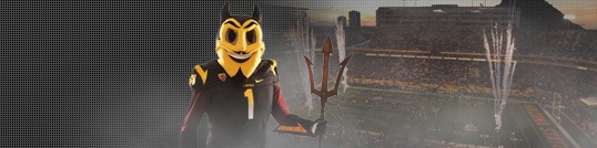
Key word there is WAS. Sparky is too cartoonish, childish,and nice looking. I think it worked well for the 70's -90's but it is out of date and fairly humorous if you ask me. A smiling devil? Come on.

This is the line of thinking that led us to these new uniforms and its just something I can't get my brain around. Sparky was/is a well designed piece of graphic art created by a very talented person.

Whats wrong with a mascot that can be described with words like "Fun", "Cartoonish", "Nice", etc? Why does everything have to be "tough", "edgy", "extreme", etc? Doesn't that seem played out to anyone? Life isn't a Mountain Dew commercial. It seems like everyone is trying to out yell and out extreme each other constantly and I just find it laughable.

Do you really think any uniform you could come up with will actually look "tough"? Its a sports uniform for heavens sake. No matter what uni the Devils (or anyone) takes the field in the other team isn't going to think "Well geeze, look how tough they look, we should just go home, I'm scared."

The goal of uniforms, wordmarks, logos, etc should be to represent your geographic area, your heritage and to be visually pleasing. This ridiculous hang up on being "tough" or "edgy" really speaks to what's wrong with sports in my opinion. Its a very stunted growth, low level of thought.... very Jim Rome-ish, it just reeks of a sad stunted adolescence.

E: And P.S. even if being "tough" is whats important to you in a logo, which is tougher, Sparky or this logo which has sparkles like a stripper:

You must be registered for see images attach
 

Nasser22

Sec. 32: Go Devils!
Joined
May 5, 2006
Posts
4,134
Reaction score
0
Most games played in our black uniform are at night, so the sun really isn't a factor. It may have been a fad before, but those come back and this generation loves them. I agree with Matt's line of thinking.

Sorry you're disappointed, but in a few months we'll all be back on the same page. Let's just win...

And whatever you may think about it, there's already a whole Blackout thing going around Facebook. I volunteer on the Gameday committee and I've seen how pathetic the fanbase has gotten. This will generate some excitement amongst the students, finally, and that is what's important right now. The students need to get back into it so we can have a real home field advantage.
 
Last edited:

O

LD @ F.O.H.
LEGACY MEMBER
Joined
Aug 2, 2002
Posts
13,905
Reaction score
5
Location
The Vortex!
There is a decal of Sparky on the back of the helmet.
 

clif

ASFN Addict
Joined
Aug 17, 2004
Posts
8,967
Reaction score
214
Location
Phoenix, az
I think they're cool. The whole black uniform hate is a bit overblown as it was when the Cards added black. As long as it is used sparingly it will be a nice alternative to the same ole. I like the pitch fork, but admit it seems a little awkward as the primary logo. In a few months it won't even matter.
 

clif

ASFN Addict
Joined
Aug 17, 2004
Posts
8,967
Reaction score
214
Location
Phoenix, az
Ps... love the matte black helmet. I always wanted to paint my truck that color. Now I got even more a reason.
 
OP
OP
chickenhead

chickenhead

Registered User
Joined
Jul 7, 2004
Posts
3,109
Reaction score
77
I'll have to see them on the field, but generally I'm with HooverDam on this one. The black is silly, and it looks bad when added to a scheme where it's not complementary. The blackout has been done. Is it really that intimidating? You wouldn't think a sea of burnt orange, or creamsicle orange, or Carolina blue would be--but when you have to go on the road in Austin or Knoxville or in the Dean dome would be intimidating, they are.

Baseball has me worried the most, though. Generally the baseball program has done its own thing, and I hope they do here. If the interlocking AS comes of the hats, then we might as well say that tradition doesn't count for anything.

By the way, I also thought the quoting of Pat Tillman in the teaser video was in poor taste.

Wow, I didn't mean for this post to pile on so much. But there it is.
 
OP
OP
chickenhead

chickenhead

Registered User
Joined
Jul 7, 2004
Posts
3,109
Reaction score
77
I didn't know that--I guess it does make a difference. But personally I still wouldn't have gone in that direction: I just would have reconsidered using his words in what is in reality a very commercial campaign.

By the way, I can also see how you'd think Sparky is corny and even a bit embarrassing. But I do like the way the logo is (was) balanced on the helmets. I wonder if he could have been redesigned to look a little more contemporary. I'm not sure if a meaner Sparky would have worked for some people, though.
 

Lefty

ASFN Icon
Joined
Jul 4, 2002
Posts
12,461
Reaction score
799
A friend of mine who graduated from ASU emailed me at work today and was not happy. He does not like the new logo and helmet. As for me, I could care less but I hope the UofA never gets rid of the A on the helmets for something like a cat paw. Like others have said, changing the logo and uniforms will not bring victories, the guys on the field have to do that. Only time will tell.

By the way, thought you would find this article interesting.
http://philiptortora.blogspot.com/
 

devilalum

Heavily Redacted
Joined
Jul 30, 2002
Posts
16,776
Reaction score
3,187
As for me, I could care less but I hope the UofA never gets rid of the A on the helmets for something like a cat paw.

Especially since they paid $100,000 to some idiot designer for that "distinctive" A.
 

Lefty

ASFN Icon
Joined
Jul 4, 2002
Posts
12,461
Reaction score
799
Especially since they paid $100,000 to some idiot designer for that "distinctive" A.

Actually it is distinctive, just like Sparky was with ASU. Now you have a pitchfork that looks like the 1977 Seattle Mariners trident logo.
 

Folster

ASFN Icon
Joined
Jun 23, 2005
Posts
16,000
Reaction score
6,207
I like the new uniforms and helmet logo. I'm not a fan of the all-blacks. I was concerned that they would go too far out like Oregon. Sans the helmet logo and the all-blacks, the uniforms are simple and traditional. There are no crazy stripes or busy designs. I like the pitchfork, although I can do without the flame or whatever is underneath it and the handle/shaft should be longer. Sparky is great, but he doesn't belong on a helmet; his pitchfork does.

I'm definitely on the same page with others who say baseball needs to keep the "AS" logo. The baseball logo needs to stay simple and classic.
 

coyoteshockeyfan

Fool In The Rain
Supporting Member
Joined
Jul 20, 2004
Posts
8,942
Reaction score
405
I dig the new helmets, that pitchfork looks much better than the one they are using for all of the other logo material. The maroon and white jerseys look good, especially with the gold pants. Not too crazy about the gradient on the numbers of the black jersey. The sleeves really drag down the uniform in my opinion, the pitchfork prong or whatever its supposed to be called looks more like a check mark or a giant swoosh.

The ASU lettering on the sleeve looks very plain from a distance and not much better from up close. Anything else would have been better on the sleeves, jersey numbers in the new font, sparky, the interlocking AS, even the university sunburst logo. The ASU lettering does look a lot better when it has the outline in a different color though, that might look pretty sweet if it were arched on the matte black helmet, sort of like TCU's pro combat helmet. Since this is Nike, there's probably going to be enough experimentation over the next couple seasons anyhow.
 

kps0001

Warriors Come Out And Plaaaay!
Joined
Aug 14, 2003
Posts
1,271
Reaction score
8
Location
PHX
This is the line of thinking that led us to these new uniforms and its just something I can't get my brain around. Sparky was/is a well designed piece of graphic art created by a very talented person.

Whats wrong with a mascot that can be described with words like "Fun", "Cartoonish", "Nice", etc? Why does everything have to be "tough", "edgy", "extreme", etc? Doesn't that seem played out to anyone? Life isn't a Mountain Dew commercial. It seems like everyone is trying to out yell and out extreme each other constantly and I just find it laughable.

I never said it had to be tough or edgy. I just think it would be a little more fitting though since it is a sun devil. devil is usually associated with the things you seem to not desire in a mascot. Maybe you should be a fan of my alma mater, NAU. Now even though that is a Lumberjack and evokes a certain amount of toughness they are able to pull off a little "cartoonish", "nice", and "fun" also. But nobody takes NAU athletics serious either in the grand scheme of things.
 
OP
OP
chickenhead

chickenhead

Registered User
Joined
Jul 7, 2004
Posts
3,109
Reaction score
77
I do admit I am excited to see them in action, though. The "fashion shows" almost always look lame, IMO. Even when the NHL unveiled the new jerseys a few years ago, and the Original Six jerseys generally looked AWESOME, it didn't look as good until they were on the ice.

Also, I would accept any kind of black, gradient, ridiculous combination if they would wear throwbacks from the Rose Bowl win once a year--with the white stripes and everything. Up here in Toronto, home of the worst uniforms in baseball, they do the old uniforms for a lot of home games, and have managed to make a lot of haters satisfied. Every guy of either a certain age or style is rocking the old hat.
 

Scott MS

Registered
Joined
Mar 8, 2004
Posts
4,144
Reaction score
15
Especially since they paid $100,000 to some idiot designer for that "distinctive" A.

They did. And that "A" came out when I was in college going to the U of A. That was in 1989 -- over 20 years ago. Money well spent since it's still going strong.
 
Last edited:

HooverDam

Registered User
Joined
May 21, 2005
Posts
6,560
Reaction score
0
I never said it had to be tough or edgy. I just think it would be a little more fitting though since it is a sun devil. devil is usually associated with the things you seem to not desire in a mascot. Maybe you should be a fan of my alma mater, NAU. Now even though that is a Lumberjack and evokes a certain amount of toughness they are able to pull off a little "cartoonish", "nice", and "fun" also. But nobody takes NAU athletics serious either in the grand scheme of things.

The general thrust of the reasonings I've heard for this change is for ASU to look more tough and edgy, sorry if those weren't your exact words.

Either way that whole notion is beyond ********. Is Oklahoma's wagon "tough"? What about a big lazy cow that represents UT? Or how about the fact that our goal every year is to go to the Rose Bowl. Literally the best case scenario for our football team is to win pretty flowers. So the idea of this whole tough/edgy nonsense just falls flat on its face to me.

And thanks for trying, but no, I'm not going to stop being a fan of ASU just because Nike and a bunch of out of touch middle aged white folks running things at ASU don't know what they're doing design wise.
 

AsUdUdE

ASFN Lifer
Joined
Jun 24, 2005
Posts
3,375
Reaction score
44
Gotta say, I was nervous for these new uniforms, but I am satisfied with them..

I think above all I am THRILLED to get rid of the road uniforms we have used in the Erickson Era, with the gold helmet, white jersey, and Maroon pants..those were down right embarrasing.. The fact that we NEVER have to deal with that again is right away an upgrade

The Black uniforms are pretty cool, I am interested to see how often they actually wear them... I would like to see the black jersey with the gold pants...

All in all it is all about branding and regardless of what we personally think about the new uniforms, stream-lining into one icon is going to help ASU, bank on it..

All that said "Fear the Fork" is cheesy and embarrassing
 
Last edited:

crisper57

Open the Roof!
Joined
Jan 23, 2007
Posts
14,950
Reaction score
1,019
Location
Phoenix, AZ
Gotta say, I was nervous for these new uniforms, but I am satisfied with them..

I think above all I am THRILLED to get rid of the road uniforms we have used in the Erickson Era, with the gold helmet, white jersey, and Maroon pants..those were down right embarrasing.. The fact that we NEVER have to deal with that again is right away an upgrade

The Black uniforms are pretty cool, I am interested to see how often they actually wear them... I would like to see the black jersey with the gold pants...

All in all it is all about branding and regardless of what we personally think about the new uniforms, stream-lining into one icon is going to help ASU, bank on it..

All that said "Fear the Fork" is cheesy and embarrassing

Fork the fork. If they wanted to re-design Sparky, I would have been interested in/more appreciative of the effort. As someone else said, this reminds me too much of FSU on the helmet now.

The black uniforms are growing on me. I love the maroon trim around the gold numbers. Otherwise this might as well have been Iowa or Mizzou.

I hate the maroon uniforms. Too much like USC, except the helmet color.

I am still trying to decide if the white uniforms look good or not.

I know I'll get flamed for this, but I'll say it. The old uniforms, while traditional, were crap. They were hideous. I hated them. These new uniforms are a welcome change, even if I am not thrilled with every single little detail.
 
Last edited:
OP
OP
chickenhead

chickenhead

Registered User
Joined
Jul 7, 2004
Posts
3,109
Reaction score
77
I don't mind that the fork looks like FSU, and actually wished it the handle was similarly present (and without the flames). Remember that FSU's design itself is borrowed from an earlier Washington Redskins helmet from the 60s which they wore again a few years ago. Like them, this would have made for a good maroon helmet. Without, you know, the racist nickname.
 

HooverDam

Registered User
Joined
May 21, 2005
Posts
6,560
Reaction score
0
I know I'll get flamed for this, but I'll say it. The old uniforms, while traditional, were crap. They were hideous. I hated them. These new uniforms are a welcome change, even if I am not thrilled with every single little detail.

Which "old uniforms"? The one's ASU wore the last 2 years were pretty bad in my opinion. The line piping on the uniforms, I didnt like the lettering and the fact that the helmet stripe and jersey stripe were different was obnoxious.

The 2007-ish Rudy Carpenter era jersey's are the best ASU ever wore:

You must be registered for see images

You must be registered for see images attach


The line weight on the helmet, collar and sleeves more or less match. Sparky is unique and distinctive. The interlocking AS on the hip is great and simple. The jersey letters and numbers are easily readable and non obnoxious.

Other than the helmet and pants/jersey gold not quite matching (which of course is fixable) those uni's were great.
 

crisper57

Open the Roof!
Joined
Jan 23, 2007
Posts
14,950
Reaction score
1,019
Location
Phoenix, AZ
Which "old uniforms"? The one's ASU wore the last 2 years were pretty bad in my opinion. The line piping on the uniforms, I didnt like the lettering and the fact that the helmet stripe and jersey stripe were different was obnoxious.

Yeah, by "old" I meant the ones we most recently wore, as opposed to "new", which just got rolled out.

Terrible.
 

devilalum

Heavily Redacted
Joined
Jul 30, 2002
Posts
16,776
Reaction score
3,187
If they do this they'll look like Oregon South.

I think I called it when the rumor first came out on page one of this thread.
ASU now has 4 colors of unis and 2 helmets to mix and match. If I'm not mistaken Oregon also started with about the same when they went "New Era."

Funny that Oregon also used to have a disney designed logo.

I like the unis well enough. I'll like them a LOT if they actually win in them.
 

Arizona's Finest

Your My Favorite Mistake
Joined
Jun 11, 2005
Posts
9,709
Reaction score
1
Not sure that my opinion matters much, but the previous design and uniforms were absolutely hideous and I think someone best described it best when they said "nacho" cheese. Seriously wtf is with that color? You should be glad thats gone and the Sun Devil, while shouldnt be completely abolished, is better moved into the background.

The pitch fork and color scheme aren't perfect (I would have gone with actual gold) but they are an improvement and between us, I thought the dorky color scheme and logo were hindering ASU with todays players over the past decade. Not like changing it was going to do anything drastic, but it was a little hard to see any 18 year old over the last decade not affiliated with the school or Tempe to say "I want to put on that uniform"

So basically it seems to be an improvement from what you had, at least IMO.

But like Mao said, it means nothing unless you guys are hiding a Chip Kelly clone somewhere or think Sendek is even going to be the equivelent of a Dana Altman (the Oregon parallel was intentional).

Coaching is what matters. And frankly when I look across the sidelines when we play our rivals in the two majors, I am in not exactly quaking in my boots.
 

Forum statistics

Threads
538,984
Posts
5,283,251
Members
6,280
Latest member
alaskabustergreen
Top