

with the new coach, new era..new site...

Redsz

We do this together
Joined
Jan 21, 2004
Posts
5,294
Reaction score
3,536
I agree with those who would like to see a slight 'tweak' in the uniforms and logo. Even though the Cardinal logo is classic, I would like to see it updated some what.

I like that Nitroseed logo. But I will throw my own two cents in with this one that I found on the net. It may be a bit too 'busy' to be a logo, but it's an example of 'meaning' up the bird.
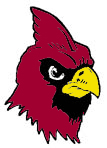
 

Attachments

  • CRAHD3.jpg
    CRAHD3.jpg
    19.6 KB · Views: 365

Redsz

We do this together
Joined
Jan 21, 2004
Posts
5,294
Reaction score
3,536
In terms of uniforms, I always liked the 89' Cardinals away jersey.

You must be registered for see images
 

ActingWild

Hall of Famer
Joined
Aug 10, 2002
Posts
1,477
Reaction score
74
Love the Balco Bird! Michael B...PLEASE make this our new logo!

P.S.

How do I insert a picture into my post?
 

LVCARDFREAK

In the league 20 years!
Joined
Mar 3, 2003
Posts
6,360
Reaction score
1
Location
Vegas
Redsz said:
I agree with those who would like to see a slight 'tweak' in the uniforms and logo. Even though the Cardinal logo is classic, I would like to see it updated some what.

I like that Nitroseed logo. But I will throw my own two cents in with this one that I found on the net. It may be a bit too 'busy' to be a logo, but it's an example of 'meaning' up the bird.


That bird looks constipated!


:eek:
 

Redsz

We do this together
Joined
Jan 21, 2004
Posts
5,294
Reaction score
3,536
You know... I never got the impression that the bird was constipated from looking at it.

But with the 'burping' bird and now the addition of 'constipated' bird. It's become a parade of body functions. :)
 

Reddog

ASFN Lifer
Joined
Jan 8, 2003
Posts
2,809
Reaction score
332
Location
Scottsdale
Black helmets, black jerseys and black pants same red bird. Remember the roof will close so the black color wont fry them.
 

BleedingPurple

Suffering Fan
Joined
Aug 4, 2004
Posts
196
Reaction score
0
Location
Chandler
We definitely need a change. These guys weren't successful with the helmet either:

LAMAR


The Lamar Cardinals (Beaumont, TX) were members of the Southland Conference through at least 1986; the program was discontinued following the 1989 season. Shown above is the helmet design used by the team until at least the early 1980s. The 1986-1989 design has been described to me as being red with white numerals on the sides and a white middle stripe. Information about other historical helmets used by Lamar would be appreciated.


Attachments

  • Lamar.gif
    Lamar.gif
    7.2 KB · Views: 78
Last edited:

JeffGollin

ASFN Icon
Joined
May 14, 2002
Posts
20,472
Reaction score
3,056
Location
Holmdel, NJ
The Muskingon, Mich Orchard View HS Cardinals had our famous redbird (wasn't his original nickname "Sonny?") on a silver-gray helmet. Looked tres cool.
 

TruColor

Trombonist in Roger Goodell's Wedding Rcpt.
Supporting Member
Joined
May 13, 2002
Posts
4,275
Reaction score
3,569
Location
Prescott, AZ
What's funny about that logo, is that a semi-pro team in Grapevine, Texas stole it and has been using it. The designer of that logo (he goes by the handle "Nitroseed") contacted them and they've agreed to change their name to "Drillers". Apparently, the owner of the team had no idea that the logos were lifted (from my own site), and they've been cooperating since.

They also stole another Cardinals concept from my site as well...

http://www.grapevinecardinals.com/
 
OP
OP
Clif

Clif

ASFN Addict
Joined
Aug 17, 2004
Posts
9,065
Reaction score
421
Location
Phoenix, az
NOOOOOOOOOOOOOOOOOOOOO!!!!!!!!!!!!!!!!!!!!!!!!!!!!!!!!!!!!!


I want that logo for the ARIZONA Cardinals Dammitt !!!
 

jf-08

chohan
Administrator
Super Moderator
Supporting Member
Joined
May 15, 2002
Posts
31,810
Reaction score
31,803
Location
Eye in the Sky
PANTONE194C said:
What's funny about that logo, is that a semi-pro team in Grapevine, Texas stole it and has been using it. The designer of that logo (he goes by the handle "Nitroseed") contacted them and they've agreed to change their name to "Drillers". Apparently, the owner of the team had no idea that the logos were lifted (from my own site), and they've been cooperating since.

They also stole another Cardinals concept from my site as well...

http://www.grapevinecardinals.com/
Imitation is the art of flattery, or something like that.
 

Ouchie-Z-Clown

I'm better than Mulli!
Joined
Sep 16, 2002
Posts
70,842
Reaction score
69,794
Location
SoCal
Redsz said:
I agree with those who would like to see a slight 'tweak' in the uniforms and logo. Even though the Cardinal logo is classic, I would like to see it updated some what.

I like that Nitroseed logo. But I will throw my own two cents in with this one that I found on the net. It may be a bit too 'busy' to be a logo, but it's an example of 'meaning' up the bird.



dude, that thing is fugly, and i don't mean in a good way.
 

Members online

Forum statistics

Threads
1,471,597
Posts
6,712,136
Members
6,438
Latest member
NamasteDave
Top