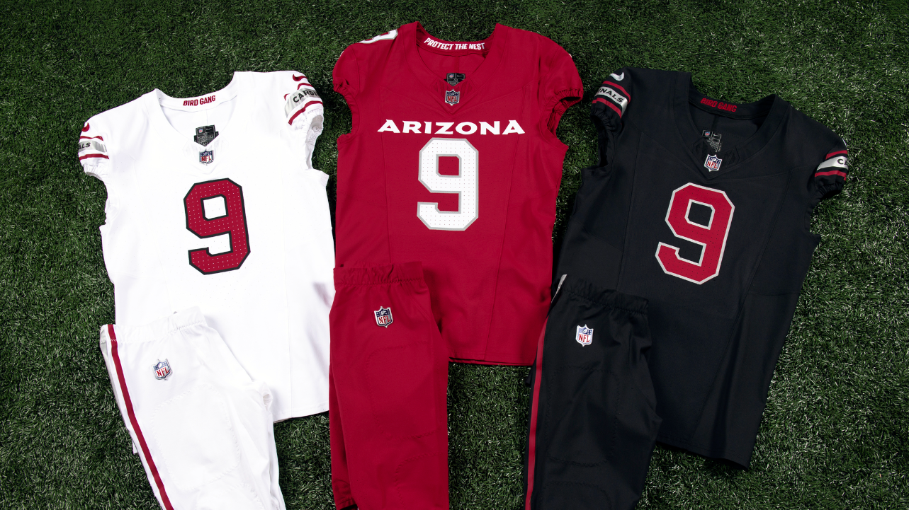
I like the white and black ones. Look sharp! Like a classic black suit. I am not a fan of the massive Arizona text, maybe a smaller text with a bit of separation between the number. Like the red embossed logo on the back neck. Need to see more photos of the pants etc to see. Might end up actually getting the white one.
I like the white and black ones. Look sharp! Like a classic black suit. I am not a fan of the massive Arizona text, maybe a smaller text with a bit of separation between the number. Like the red embossed logo on the back neck. Need to see more photos of the pants etc to see. Might end up actually getting the white one.
The fabric nuances on the uniforms are dare I say sublime and better than any other NFL uniform I have seen... makes the Ram's plastic decal numbers even more preposterous
That’s what I like about the ALL whites. I want our linemen to look huge. I still remember how imposing our OL looked back in the 60’s/70’s in the all whites. I love the all whites, and like the other 2. I love the bigger bird on the helmet. I HATED the red shoulder pad look on our old roadies, so happy as hell they are being replaced. Would like to have seen a white stripe down the red pants.
I refuse to complain about these, considering how terrible they could have turned out. Safe, classic, if uninspired. They have a few months to fix the font spacing, or is giant smooshed text 'in'?